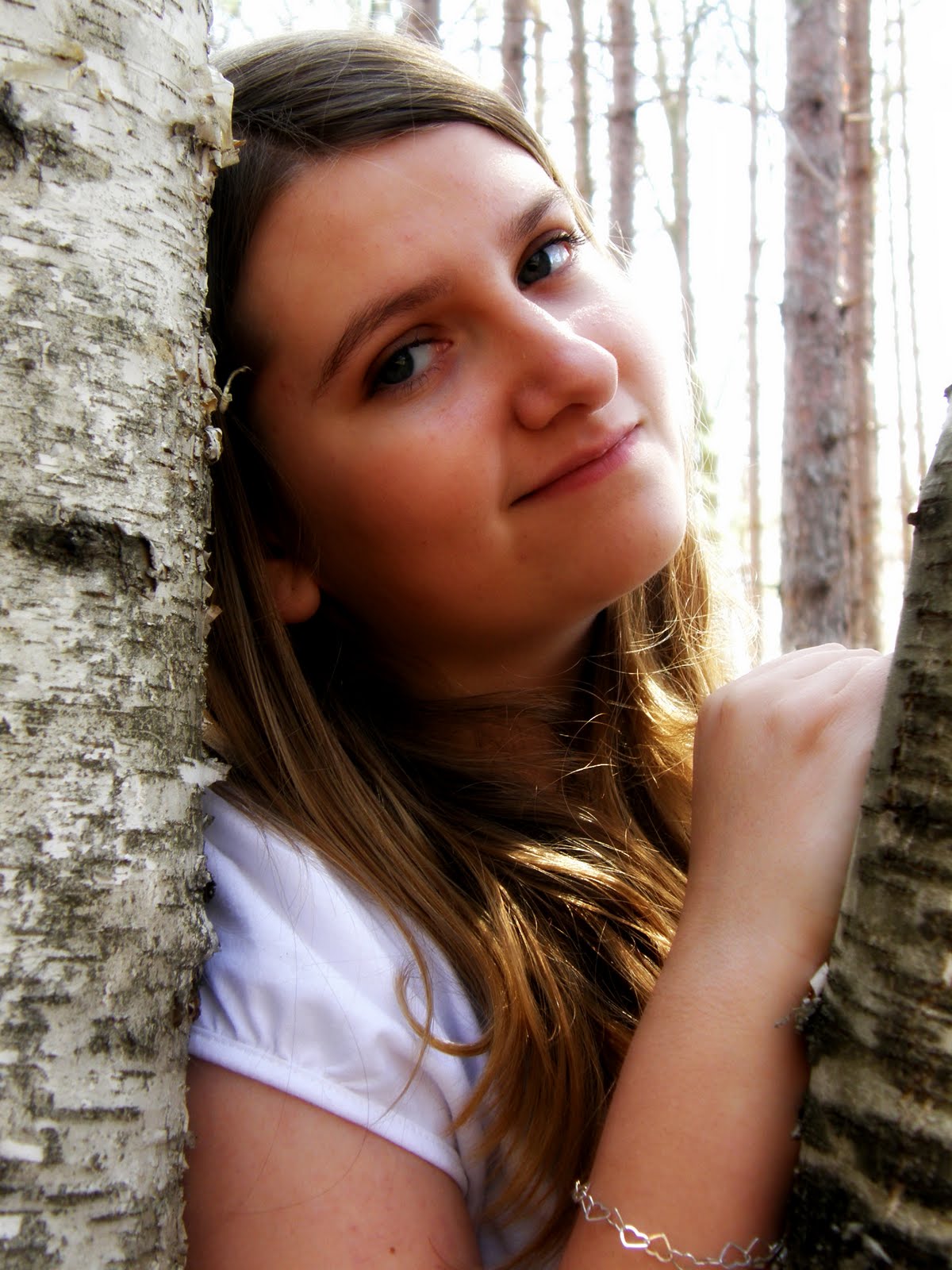
This is a picture I took of Brittany a couple of years ago, but it remains one of my favorites of her so far. She seldom let's me doll her up for a photo shoot, so when she does, I take full advantage of it! The funny thing is, when her friends see these pictures of her with her hair curled and make up on, they don't even recognize her!
This layout was done using a new line from Die Cuts With a View. It's called Ciao Bella which means Hello Beautiful. I thought it was a perfect title for this page and even used the actual label from the paper pack to make the title! This is a gorgeous line of paper that has several pages of glitter papers and raised surface papers. It is also much thicker than the normal paper you will find from DCWV. This has more of a card stock feel to it.
I love the raised surface papers for inking. The design stays visible, while the ink clings the the lower surface. It really makes the design pop!
I used a few different sheets from this pack to do this layout, most of which had the raised surfaces. I really did very little to the design elements myself, as the papers did all of the work for me!
I did some chalking on the right side to fill in areas that the picture didn't cover. I cut out the center of the paper to insert the picture and use it more as a circular frame.
Look for this new line of papers from Die Cuts With a View! I can bet you'll love them too!
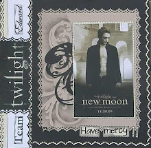
Thanks for dropping by!


.jpg)


 This is a glamor shot I took of myself a while ago. I used my favorite editing program Picnik to add the cool effects! I changed the exposure on the picture to lighten it and saturated the colors to make my eyes and lips colored. Then I used the Tint option to make the photo nearly black and white and only leaving my eyes and lips colored. It's a really interesting effect!